

Delaware Industrial Affairs
Enterprise Government UX · Workflow & Information Architecture
Role: Lead UX Designer
Client: Tapp Network · State of Delaware (Division of
Industrial Affairs)
The Division of Industrial Affairs (IA) is responsible for enforcing labor laws and protecting workers across Delaware, particularly vulnerable populations.
The platform needed to serve multiple audiences—employees, employers,
and community organizations—while navigating high-stakes, compliance-driven workflows.
Primary challenge:
Making complex government services understandable, approachable, and safe to access without overwhelming or intimidating users.
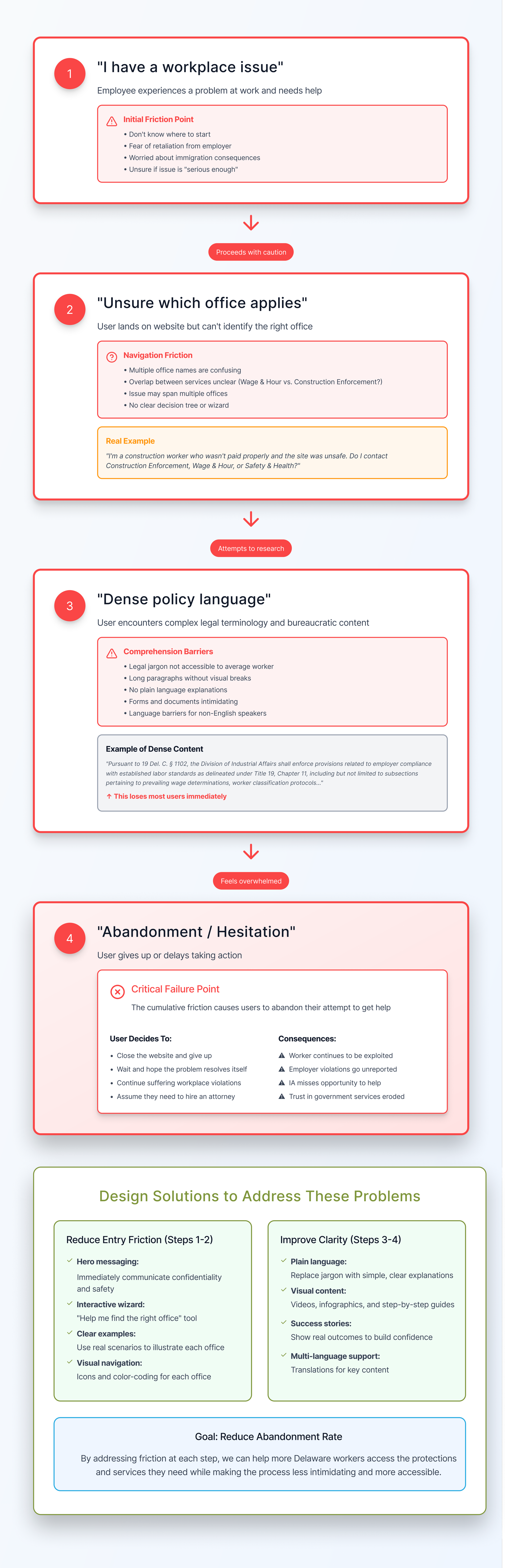
The Problem
Users often:
Didn’t know which IA office applied to their situation
Were hesitant to reach out due to fear of retaliation or legal complexity
Faced dense, policy-driven content that didn’t match real-world mental models
The existing experience prioritized organizational structure over user intent, making it harder for people to find help quickly.
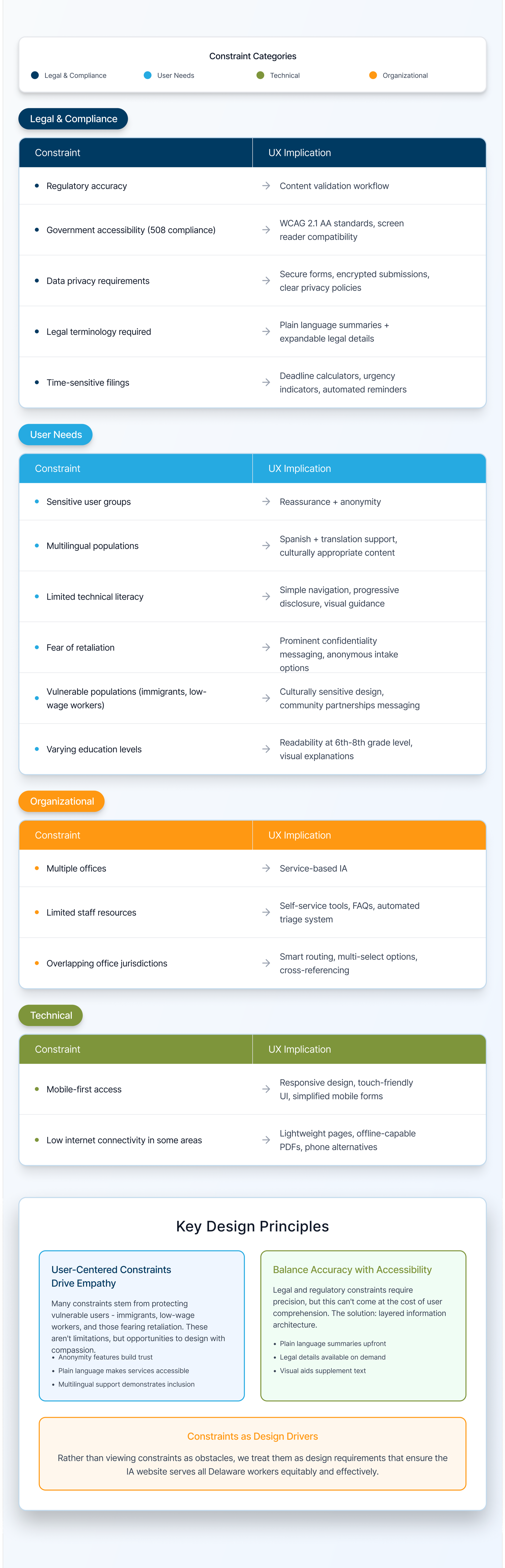
Constraints
Regulatory and policy accuracy required
Multiple IA offices with distinct responsibilities
Highly sensitive user scenarios (wages, discrimination, safety, immigration concerns)
Accessibility and clarity were non-negotiable
Content needed to work for both employees and employers
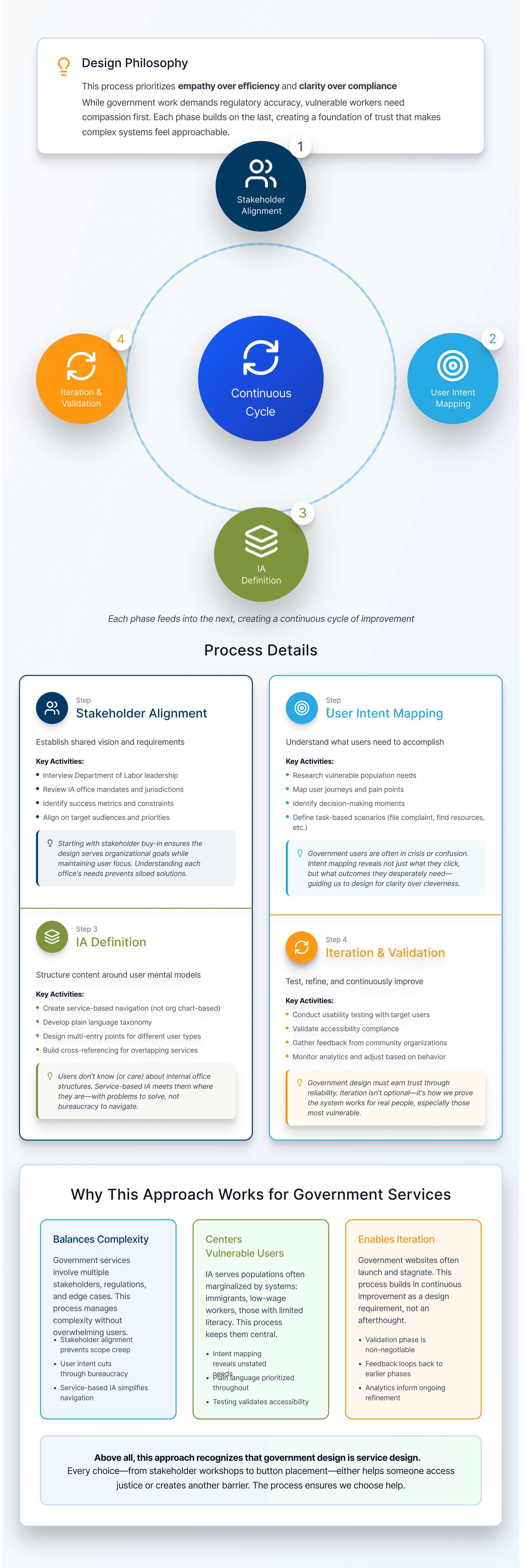
My Role & Approach
I led UX end-to-end, partnering with stakeholders to translate policy and enforcement processes into a clear, human-centered information architecture.
Instead of starting with UI, I focused on:
Clarifying user intent (“What problem am I trying to solve?”)
Mapping services to real-world scenarios
Reducing cognitive load through progressive disclosure
Designing clear pathways to action without legal intimidation
UX Challenges
The visuals below show the old platform and its clear challenges. Our user research showed:
Users needed shorter more focused sections
Clear hierarchy
Distinct user intent and easy to understand differentiation
Simple step-by-step process
The image on the left is the old hi-fi wireframe, and the image on the right shows the wireframe and the challenges we observed:
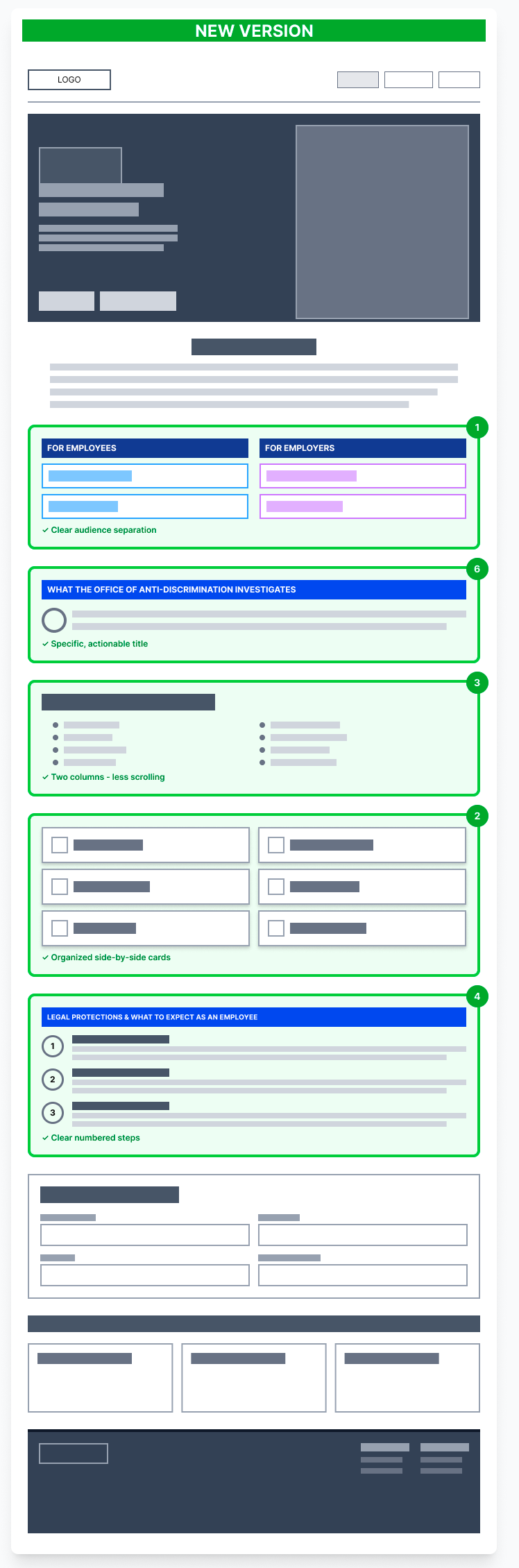
Solution
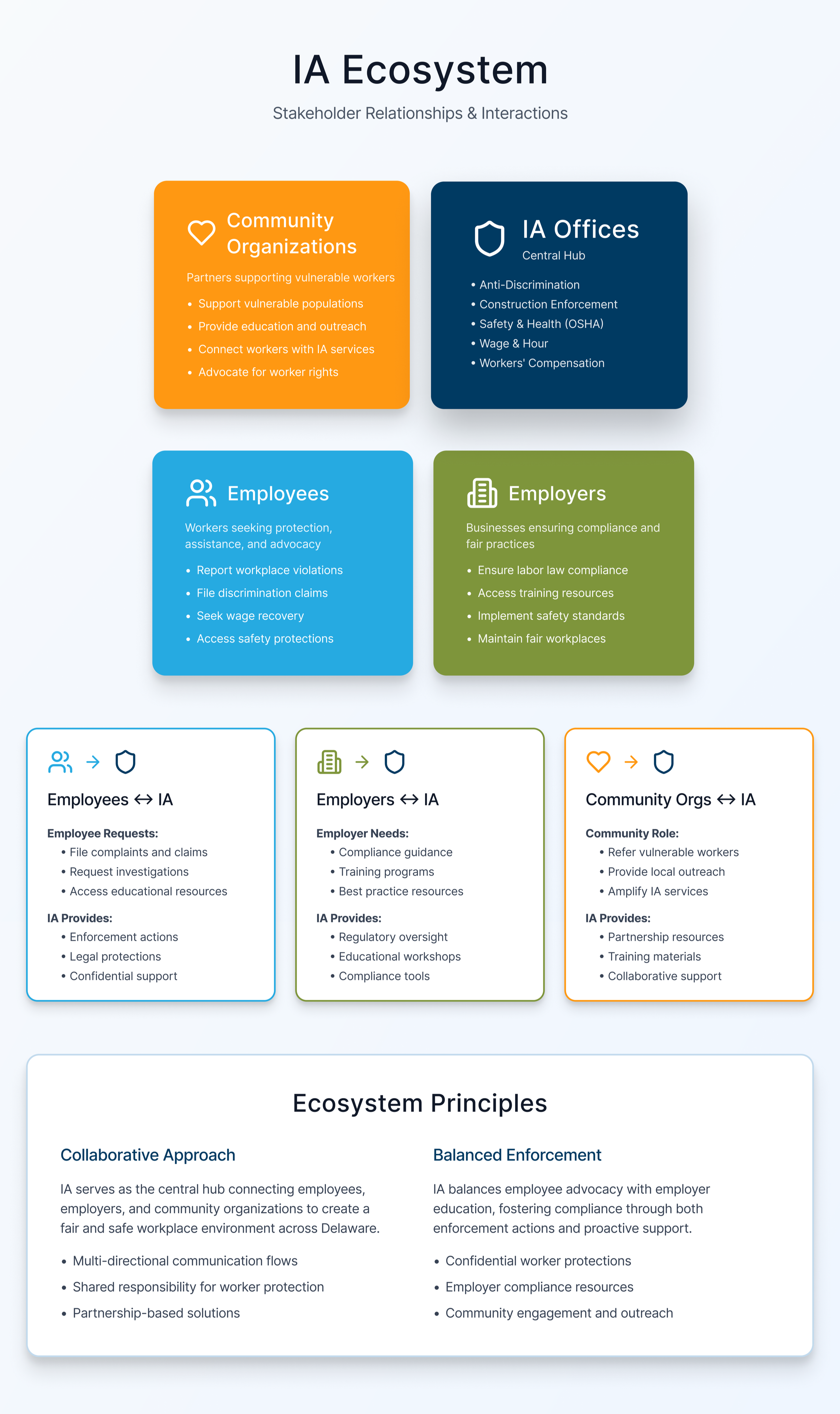
Information Architecture & Flow
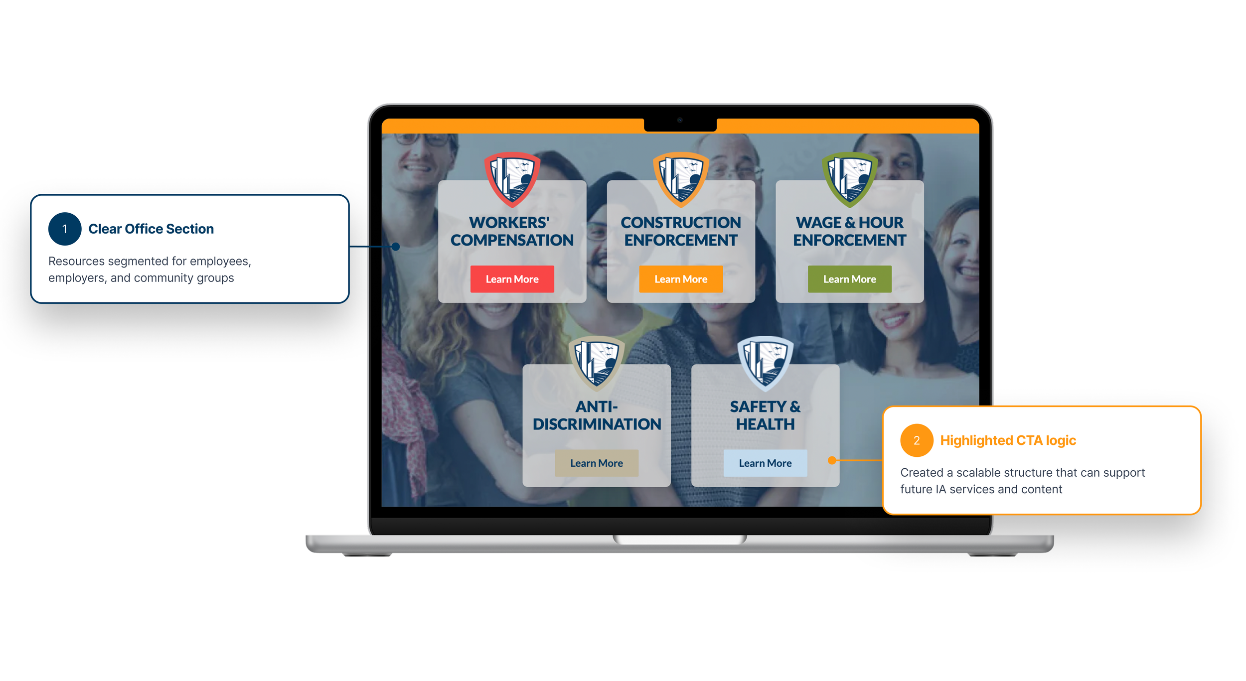
The platform is structured around user needs first, not internal departments:
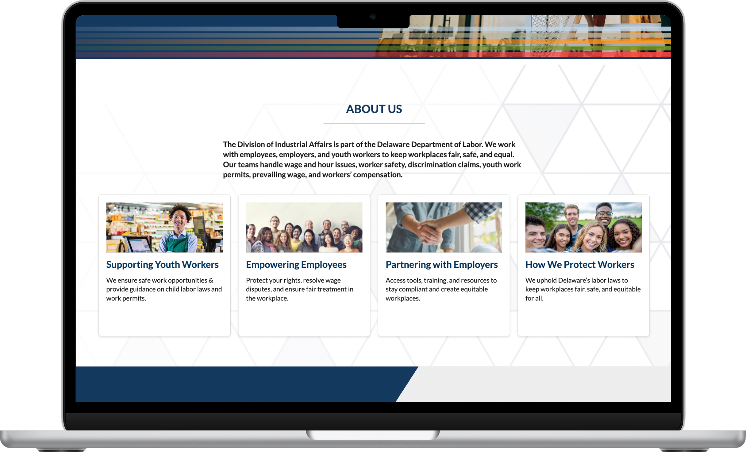
Platform Redesign
Clear CTA’s in the hero
Audience separation for quick identification
Simple, straightforward value proposition that is understandable
Two columns with side by side comparison and less scrolling
Clear, numbered steps that are easy to follow
Below is a visual of the new hi-fi platform design on the left, and the wireframe updates on the right:
Outcomes & Impact
Improved clarity around which IA office handles specific issues
Reduced friction for users seeking help in sensitive situations
Stronger stakeholder alignment around user-centered service delivery
Key UX decisions:
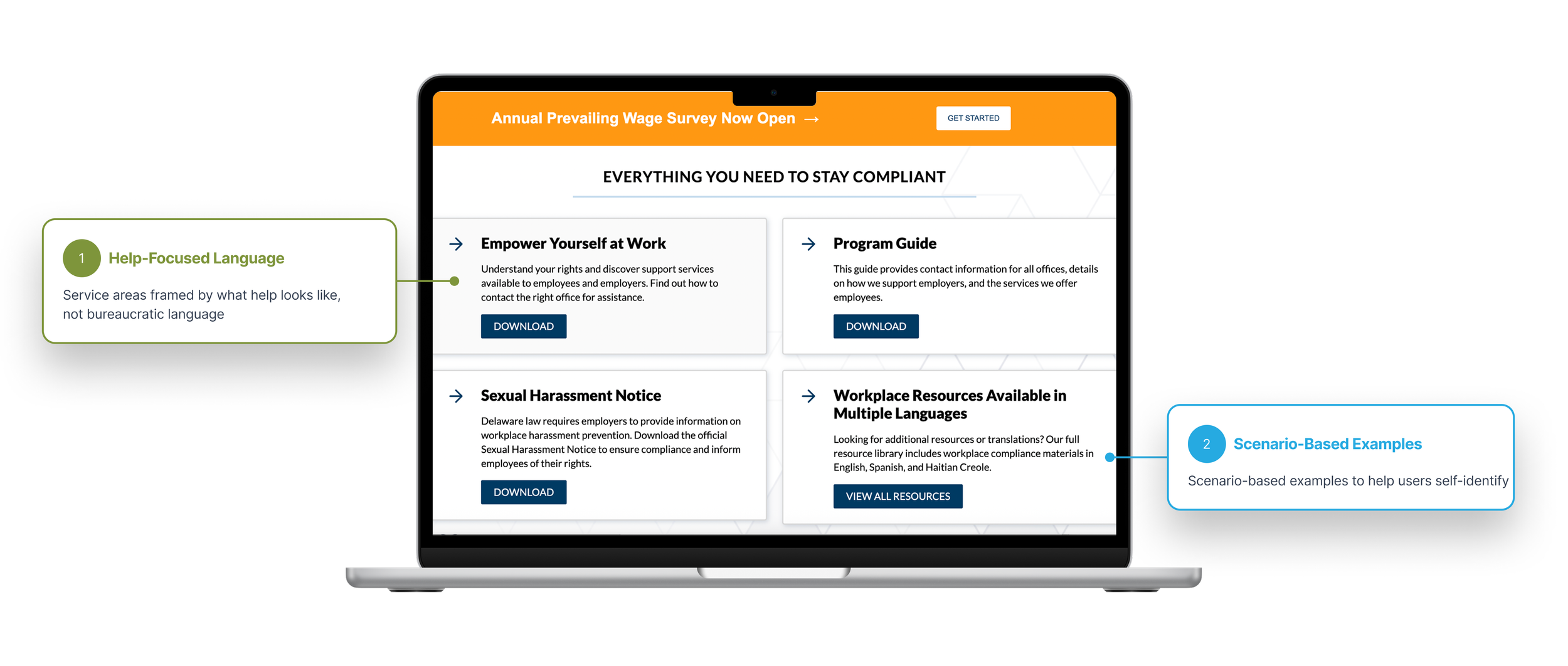
A service-driven landing page with clear CTAs (“View All Resources”)
Office sections framed with real examples, not abstract descriptions
A centralized contact flow that routes users correctly without requiring prior knowledge
Resources segmented for employees, employers, and community groups
Key Takeaway
Designing for government services requires balancing clarity, empathy, and compliance. This project reinforced the importance of grounding enterprise UX in real human scenarios—especially when users are navigating risk, fear,
or uncertainty.
Before
Services were disorganized and policy language confused users, leading to low completion rate
Users needed prior knowledge of government structures to determine where to start
Dense content increased cognitive load and hesitation, especially for first-time users
Unclear pathways led to confusion and drop-off in high-stakes scenarios
After
Services are framed around real-world user needs and scenarios, not just internal office structure
Clear examples help users quickly self-identify the correct service and next step
Simplified language and hierarchy reduce cognitive load and decision fatigue
Focused buttons and calls to action guide users confidently toward assistance without requiring prior expertise