
UX Design
ROLE:
Team Lead, Visual Design, Interaction
Crocs challenged us to rethink how customers could discover and create products that feel uniquely their own. Our goal was to design experiences that mirrored the fun of walking into a Crocs store—where you can browse freely, get inspired, or build something entirely personal. The result was two connected concepts: “Show Us Your Style,” an
AI-powered inspiration tool, and a reimagined Customize Your Crocs flow for mobile
and desktop. Together, these projects showcase how UX can blend playfulness, personalization, and commerce to deepen brand connection and drive engagement.
Project Snapshot:
Designed mobile + desktop Crocs customization experience in 3 screens.
Introduced their first AI assistant for inspiration-driven shopping.
Built responsive dark-mode UI system with tokens and reusable components.
Balanced user delight with business goals: engagement + accessory sales.

Project 1: Show Us Your Style
Crocs challenged us to create a mobile-first shopping experience that felt fresh, playful, and aligned with their Come As You Are brand spirit. The team asked for something unexpected — a way to inspire users and guide them toward discovering products they’d love.
I needed to design a concept that allowed new users to explore Crocs in a way that mirrored the in-store experience — browsing freely or asking for help. The solution had to feel intuitive on mobile, highlight Crocs’ breadth of products, and provide a foundation for personalization.
Research Process
I began by studying customization and inspiration tools across leading e-commerce and lifestyle brands (Nike By You, Vans Customs, Adidas Confirmed, Everlane, and Gymshark). While Nike and Vans allowed deep personalization, their flows could be time-consuming and overwhelming. Everlane stood out for guiding users with curated storytelling and simple entry points.
These findings shaped my goal: Crocs could blend guided discovery with playful personalization to stand out.
Competitive Benchmarking
Built user flows starting with a custom landing page explaining the tool.
Users + Persona
Based on data provided by Crocs, their core users consist of:
Impulse Mobile Shopper – seeks fast, engaging experiences that lead to instant purchases.
Style Explorer – inspired by trends, aesthetics, and creative expression; willing to experiment.
Gift Giver – wants easy recommendations, confidence in style choices, and convenience.
These personas highlighted a need for both inspiration-first tools (for explorers) and speed-first flows (for impulse buyers).
Experience Mapping & Pain Points
I mapped the existing Crocs.com journey and uncovered pain points:
No clear onboarding or landing to guide first-time users into customization.
Limited pathways to discover styles based on personal expression or inspiration.
Accessories (Jibbitz) positioned as secondary instead of part of the design experience.
Checkout flow disconnected from the sense of fun built earlier.
Research Outcome
Research revealed two opportunities:
Create a guided entry point like “Show Us Your Style” to spark inspiration and connect with Crocs’ Come As You Are ethos.
Build a streamlined customization flow that’s playful, intuitive, and encourages accessory add-ons.
Together, these approaches connect inspiration → customization → checkout, aligning with Crocs’ brand and sales goals while delighting users with a unique, personalized shopping journey.
Design
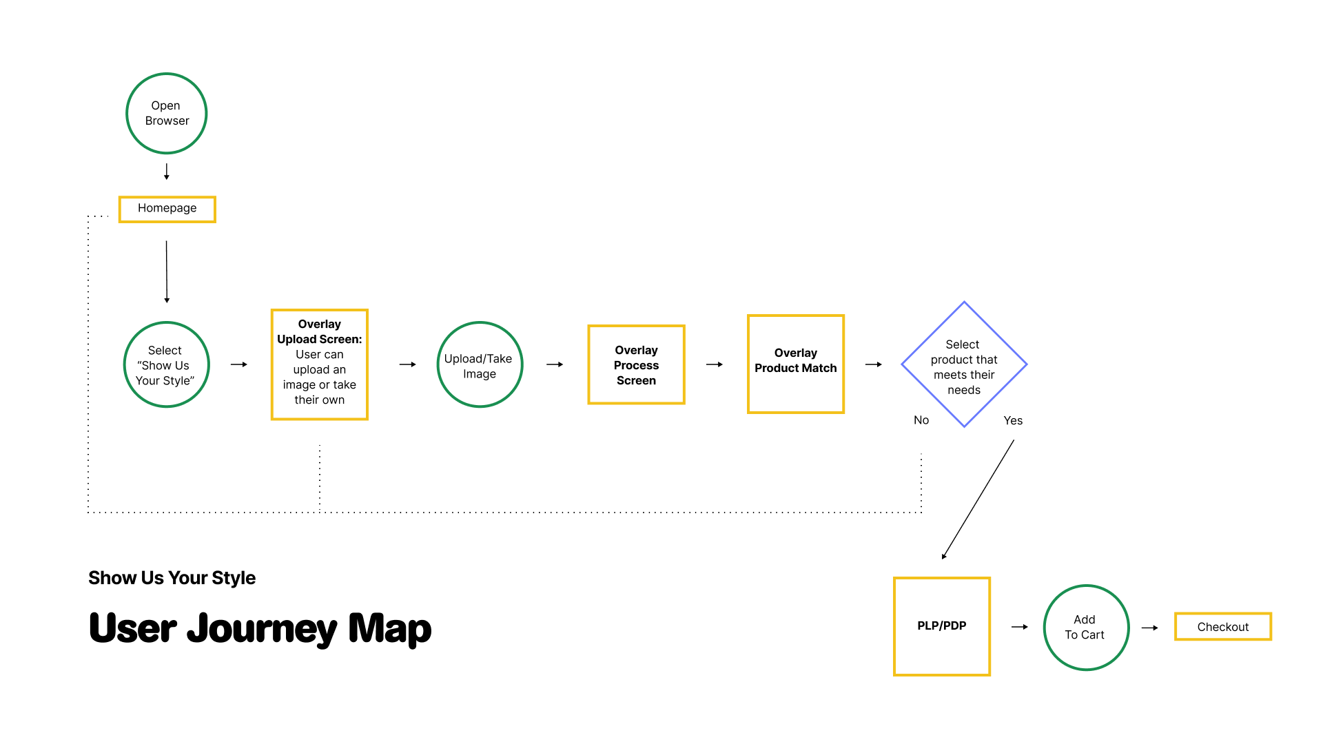
I designed “Show Us Your Style”, an AI-powered assistant where users could upload images of people, places, or things that inspire them — from streetwear looks to vacation photos. The system analyzed the input and suggested Crocs products, colors, and Jibbitz that matched their aesthetic.

Designed clean UI that emphasized imagery and personalization over menus.
The Result
The concept created an immersive entry point into the Crocs ecosystem, making product discovery feel like an act of self-expression. This approach positioned Crocs not just as a footwear brand, but as a playful style companion. The team feedback was that it felt innovative, outside-the-box, and true to Crocs’ fun DNA.
Project 2:
Customize Your Crocs
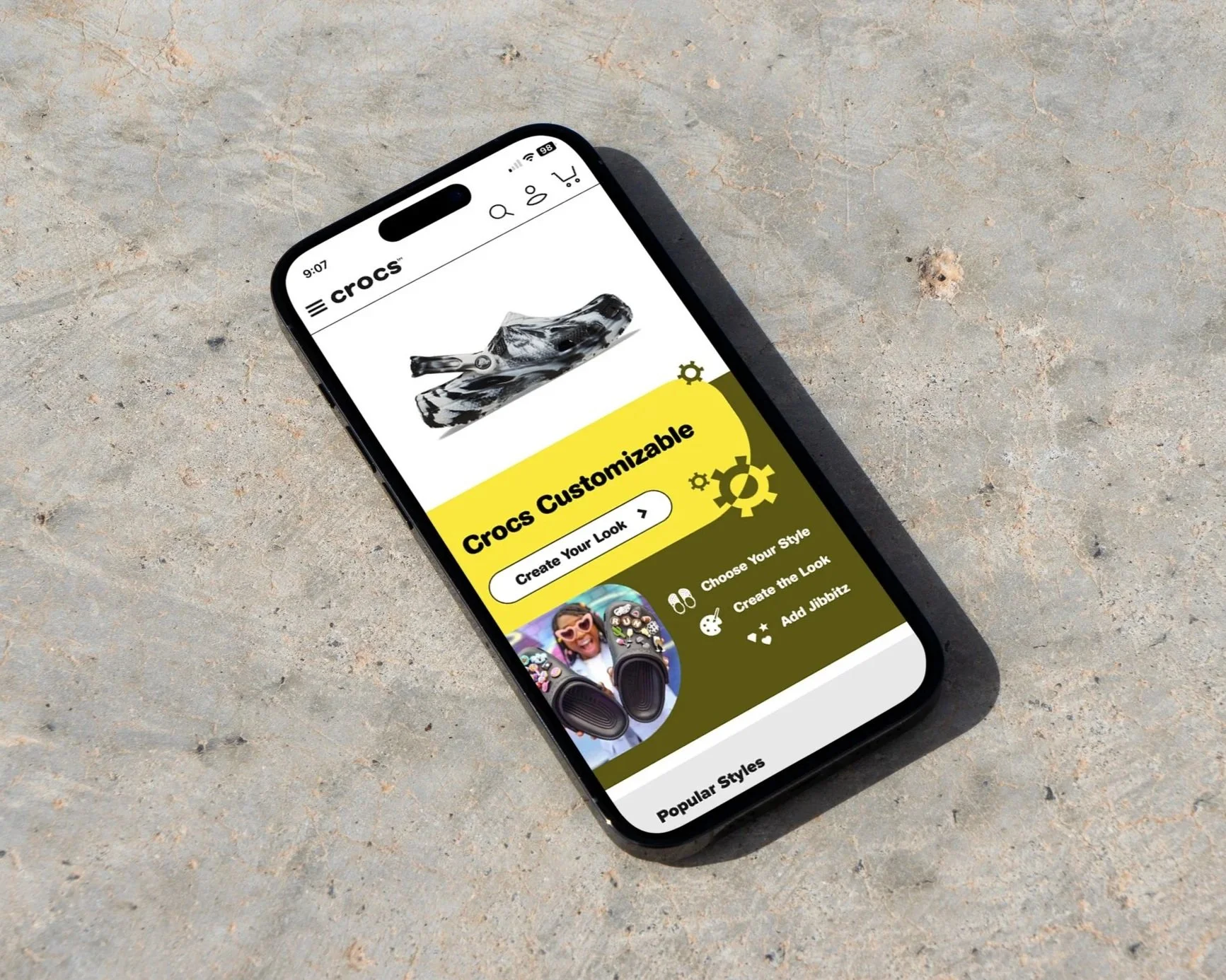
After establishing “Show Us Your Style” as an inspirational entry point, the next challenge was to design the end-to-end customization journey for both mobile and desktop. Crocs’ existing site had customization options, but they lacked a modern, engaging, and intuitive flow.
I set out to reimagine the customization process so users could quickly build their own pair of Crocs in seconds, while still allowing for deep personalization. The flow needed to balance clarity, creativity, and brand playfulness.
The research from Show Us Your Style directly informed the design of the Customize Your Crocs UI. By learning that users wanted both inspiration and speed, I built the customization flow to mirror that balance: a clear landing page to onboard new shoppers (addressing the pain point of unclear entry), quick base style and color selection for impulse buyers, and playful, drag-and-drop Jibbitz placement for explorers who value creative expression. Insights into visual inspiration tools also shaped the integration of an AI assistant, allowing users to either design from scratch or instantly generate suggestions based on uploaded images. This ensured the customization UI wasn’t just a product tool, but a continuation of the inspirational journey that began with “Show Us Your Style.”
Research Process
The Customize Your Crocs experience was designed with a mobile-first approach, giving users an intuitive, step-by-step flow for personalization. On mobile, the journey begins with a simple landing page that explains the tool, followed by a vertical sequence where users select a base style, apply colors or patterns, and then add Jibbitz charms through a playful drag-and-drop interface. For desktop, the layout expands into a side-by-side view: the shoe preview remains persistent on one side while customization controls—colors, patterns, and accessories—sit alongside it, allowing for faster iteration and comparison. Both designs share a consistent visual language and responsive components, ensuring the experience feels seamless, fun, and true to Crocs’ playful brand identity no matter the screen size.
Design

Custom Landing Page
Introduced the tool, showed how to get started, and reinforced Crocs’ Come As You Are ethos.
I designed a three-screen flow:
Style & Color Customizer
Allowed users to pick a base silhouette, add colors, images, or patterns, and see updates in real time. The shoe itself acted as the UI — tap the strap to change it, tap holes to add charms.
Jibbitz Accessorizer
A playful, drag-and-drop interface where users could place charms directly onto their Crocs. AI could also suggest charm bundles based on themes, past purchases, or uploaded inspiration.
To streamline delivery and maintain consistency, I built the customization UI using design tokens, variables, and component-based thinking. Colors, typography, and spacing were tokenized, making it simple to toggle between light and dark themes without redesigning each screen. Shared components such as buttons, cards, and product modules were built with variables for background, text, and accent states, ensuring the dark mode experience was visually cohesive across both mobile and desktop. This approach not only sped up iteration but also created a flexible system that could scale globally while keeping Crocs’ playful brand identity intact.
Dark Mode

Design Tokens
Defined a token library for color, typography, and spacing, enabling instant theme swaps between light and dark mode.
Variables
Applied variables to key UI elements (backgrounds, text, accents), allowing consistent visual updates across mobile and desktop.
Scalability
The system ensured that new features, seasonal campaigns, or regional site updates could be implemented quickly while preserving Crocs’ brand identity.
Component Thinking
Built reusable components for buttons, cards, product modules, and navigation so updates applied globally with minimal effort.
Desktop

To ensure the experience was seamless across devices, I adapted the mobile-first designs to desktop by restructuring layouts for larger screens while maintaining consistency in flow and hierarchy. On desktop, customization tools and product previews were placed side-by-side for efficiency, while mobile kept a vertical, step-by-step flow for clarity. Responsive grids, scalable components, and flexible imagery allowed the UI to adjust fluidly across screen sizes, ensuring that whether on a phone, tablet, or desktop, users could enjoy a playful and intuitive Crocs customization experience.
The Result
The final concept combined speed and playfulness: users could either let AI build a shoe for them instantly or take full creative control. The design emphasized Crocs’ brand values of individuality and fun, while also aligning with sales strategy by encouraging accessory add-ons. Process images (wireframes, UI screens, and prototypes) illustrated how the journey evolved from initial sketches to polished flows.
KPI’s
Higher conversion by simplifying flows - 24%
Increased Jibbitz attachment rate through playful accessorizing - 36%
Stronger brand loyalty through unique, personal shopping experiences.
Key Learnings
This project taught me how to balance inspiration and efficiency, turning a playful brand experience into a seamless digital journey. By combining clear onboarding, intuitive UI, and scalable systems, I was able to design flows that were both fun for users and effective for business goals.
Onboarding matters – a custom landing page reduced friction and set expectations.
Playful mechanics drive delight – drag-and-drop Jibbitz made accessorizing memorable.
Scalable systems save time – tokens, variables, and components ensured flexibility across mobile, desktop, and dark mode.
Balance is key – inspiration-first tools and speed-first flows served different user needs.