

Components, Tokens, & Variables
Our goal wast to design a scalable, component-driven UI system for Crocs that leverages design tokens and variables to ensure consistency, flexibility, and efficiency across digital touchpoints.
The objective was to explore how a tokenized system could support Crocs’ expressive brand identity while maintaining strong accessibility, responsiveness, and ease of reuse. This project focused on translating brand principles into modular components that could adapt across contexts without sacrificing cohesion or usability.
My Contributions
Component Architecture
Designed a modular set of core UI components, built with flexible variants and states to support reuse across layouts while maintaining clear structural hierarchy and interaction patterns.
Tokenization & Variables Strategy
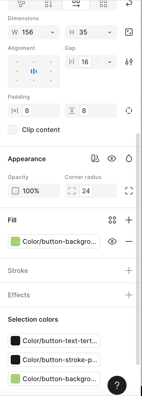
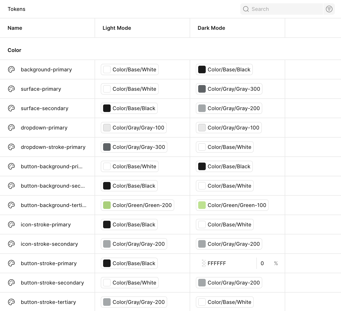
Established a design token framework for color, typography, spacing, and elevation, implemented using Figma Variables to enable centralized control and rapid iteration across components.
Brand Expression Through System Design
Applied Crocs’ bold, playful visual language through tokenized values, allowing the brand’s personality to emerge without hard-coding stylistic decisions into individual components.
Accessibility & Responsiveness
Considered accessibility standards and responsive behavior throughout component design, ensuring legibility, sufficient contrast, and adaptable layouts across breakpoints.
System Documentation
Documented component usage, variants, and token relationships to clearly communicate intent, constraints, and best practices within the system.
Client
Crocs
Skills & Tools
Figma, Figma Variables, Design Tokens, Component Architecture, Accessibility Principles, Responsive Design
Team
Jackson Jewett, Lead UX Designer
Impact
This project resulted in a cohesive, token-driven component system that demonstrates how a strong brand identity can coexist with modular, scalable design practices. By separating visual styling from structural components through tokens and variables, the system enabled faster iteration, easier updates, and greater consistency across the UI. The work highlights a product-oriented approach to design systems—one that prioritizes maintainability, flexibility, and long-term scalability while supporting expressive brand storytelling.
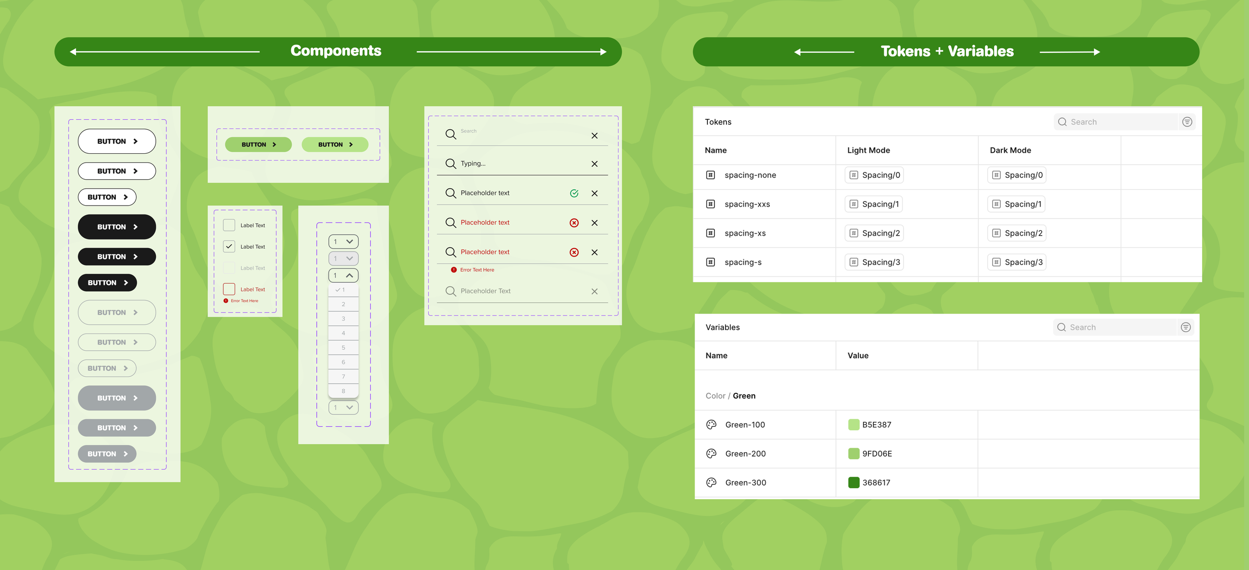
UI Components
Building Blocks with Brand Personality
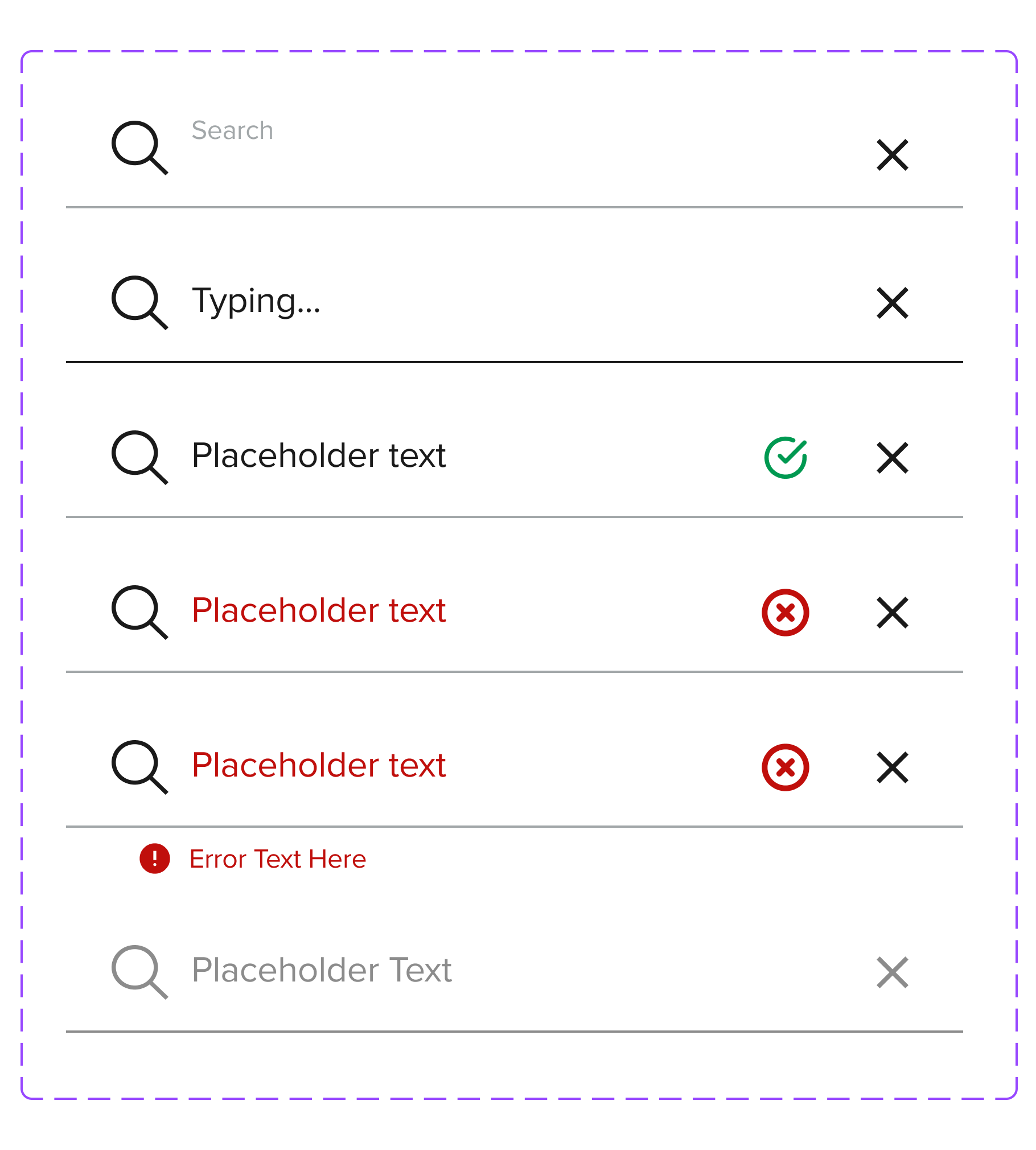
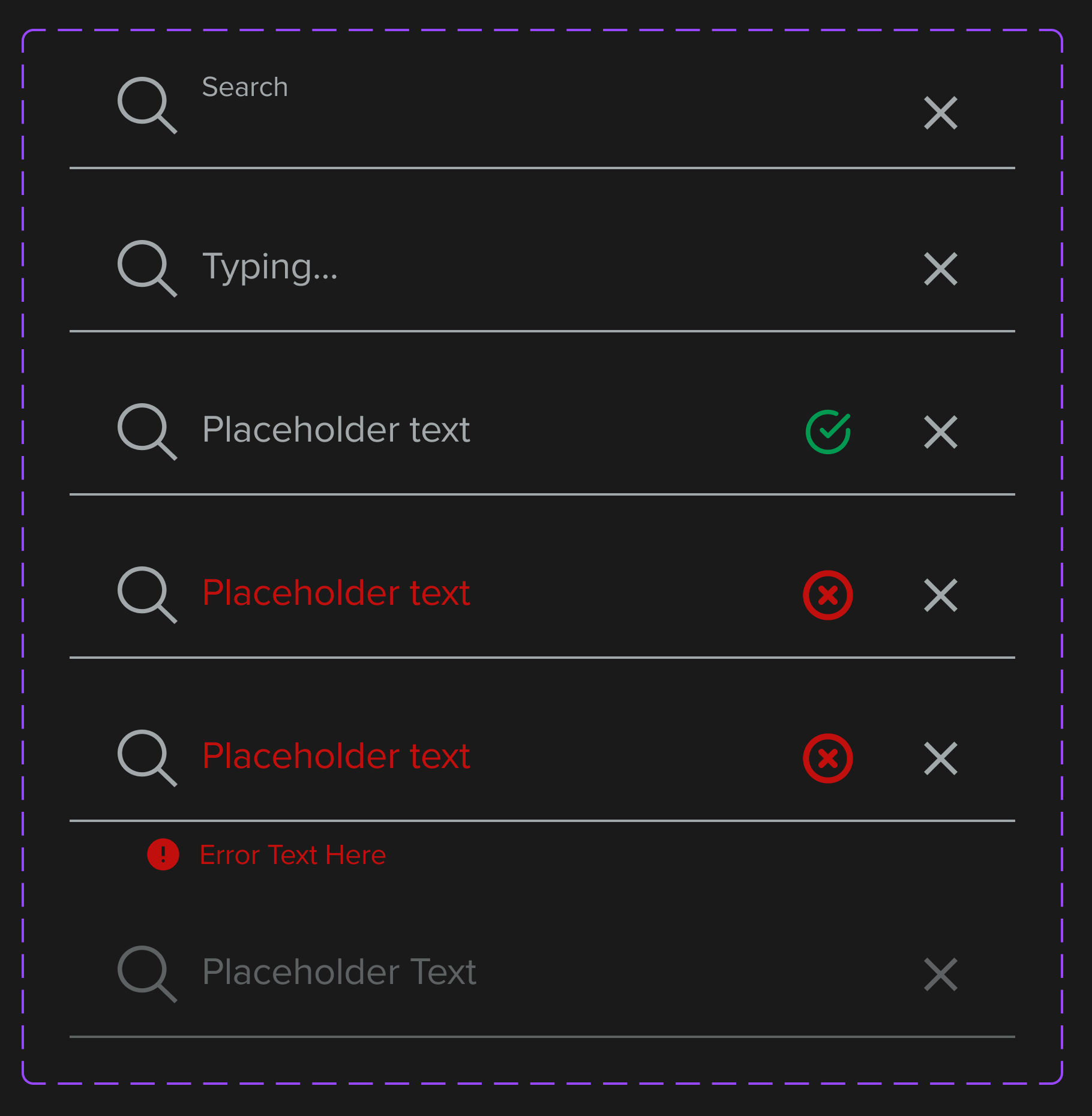
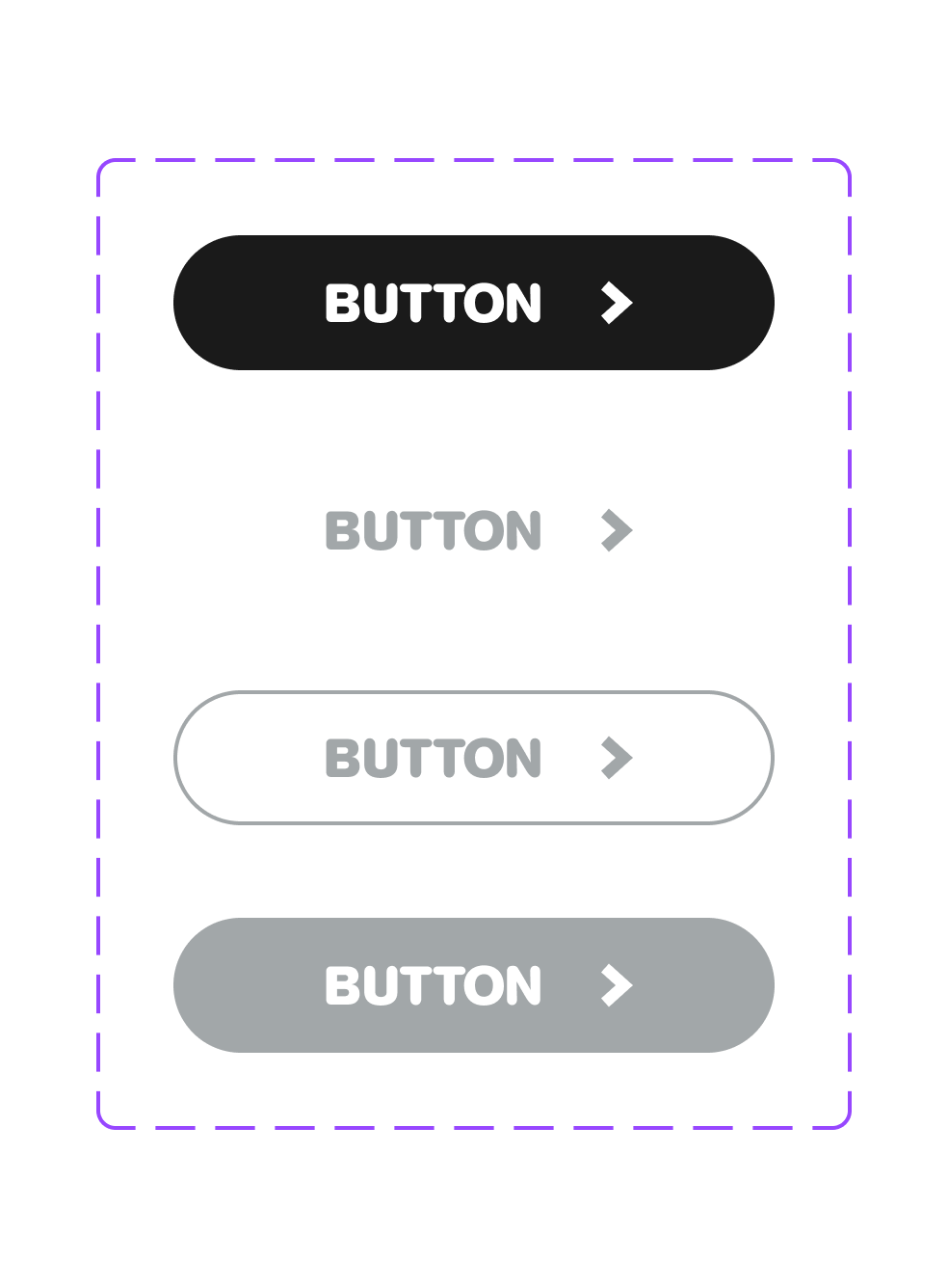
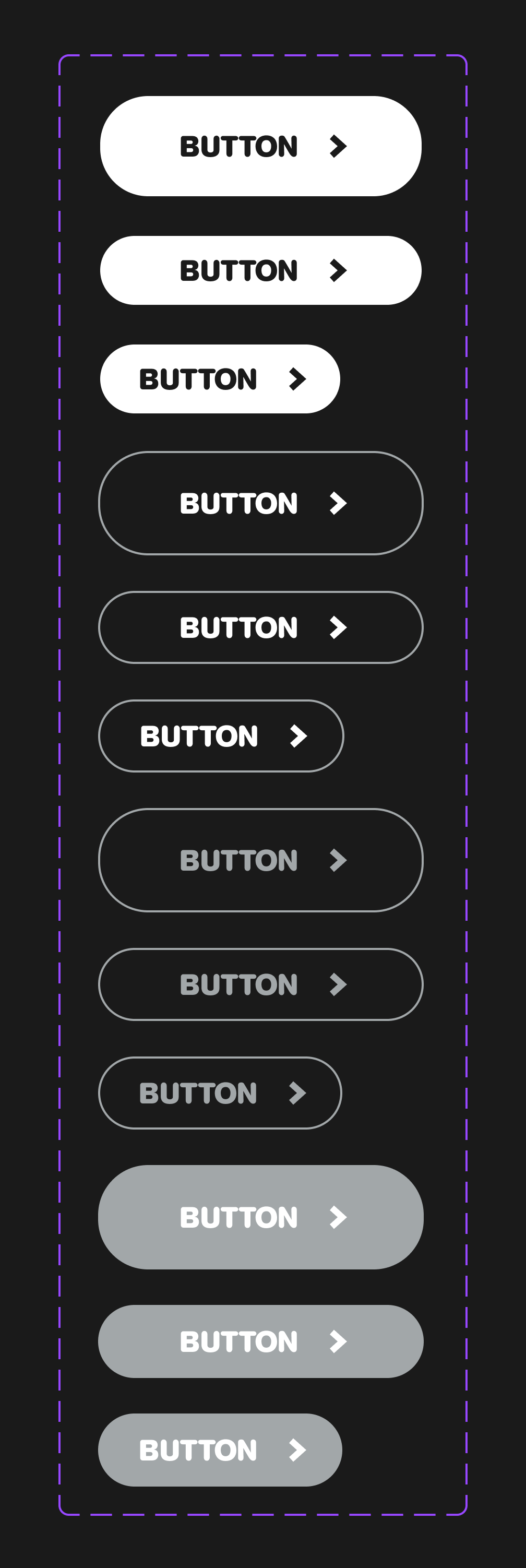
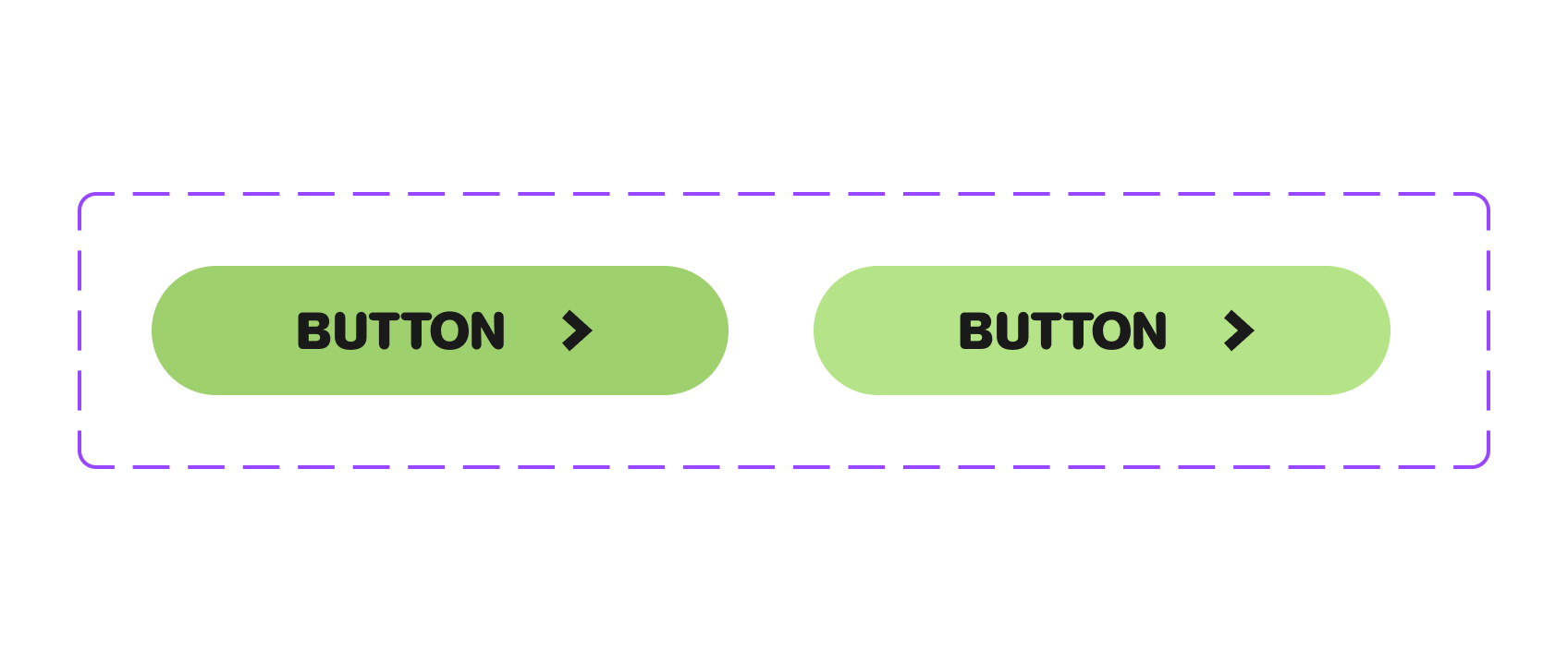
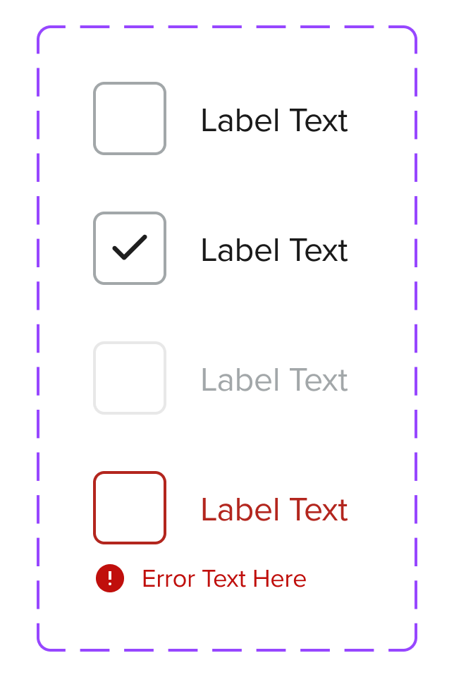
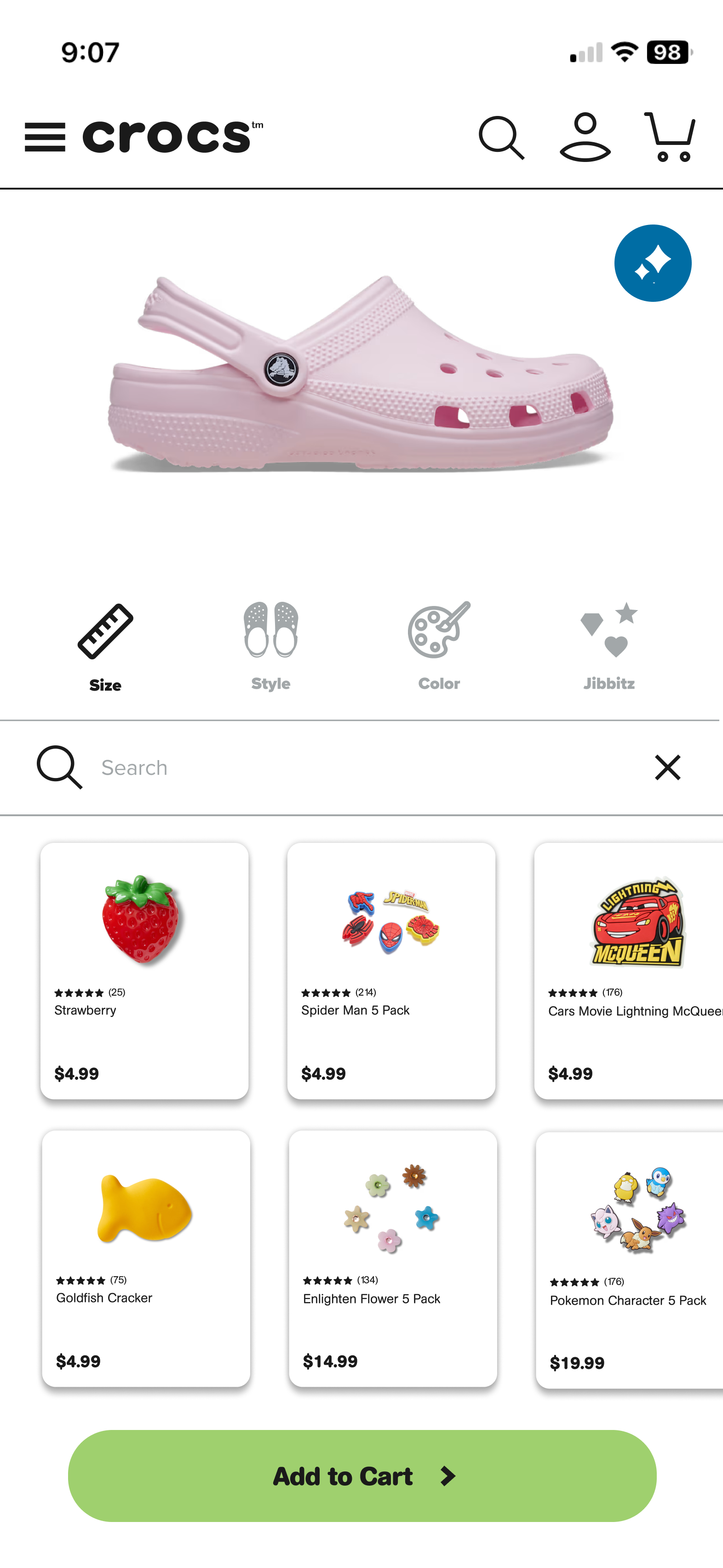
Core UI components form the foundation of every digital experience and are often the most direct expression of a brand in use. For the Crocs design system, I designed a comprehensive set of modular components—including buttons, links, navigation bars, search inputs, dropdown menus, checkboxes, radio buttons, and toggles—built to balance expressive visual design with consistency, accessibility, and scalability.
Each component is constructed on a shared structural foundation, with visual attributes controlled through design tokens and Figma variables. Color, typography, spacing, border radius, and motion values are abstracted from the components themselves, allowing Crocs’ playful, energetic brand to come through without sacrificing system integrity. This separation ensures components remain flexible and easy to adapt while maintaining predictable interaction patterns.
Navigation & Discovery
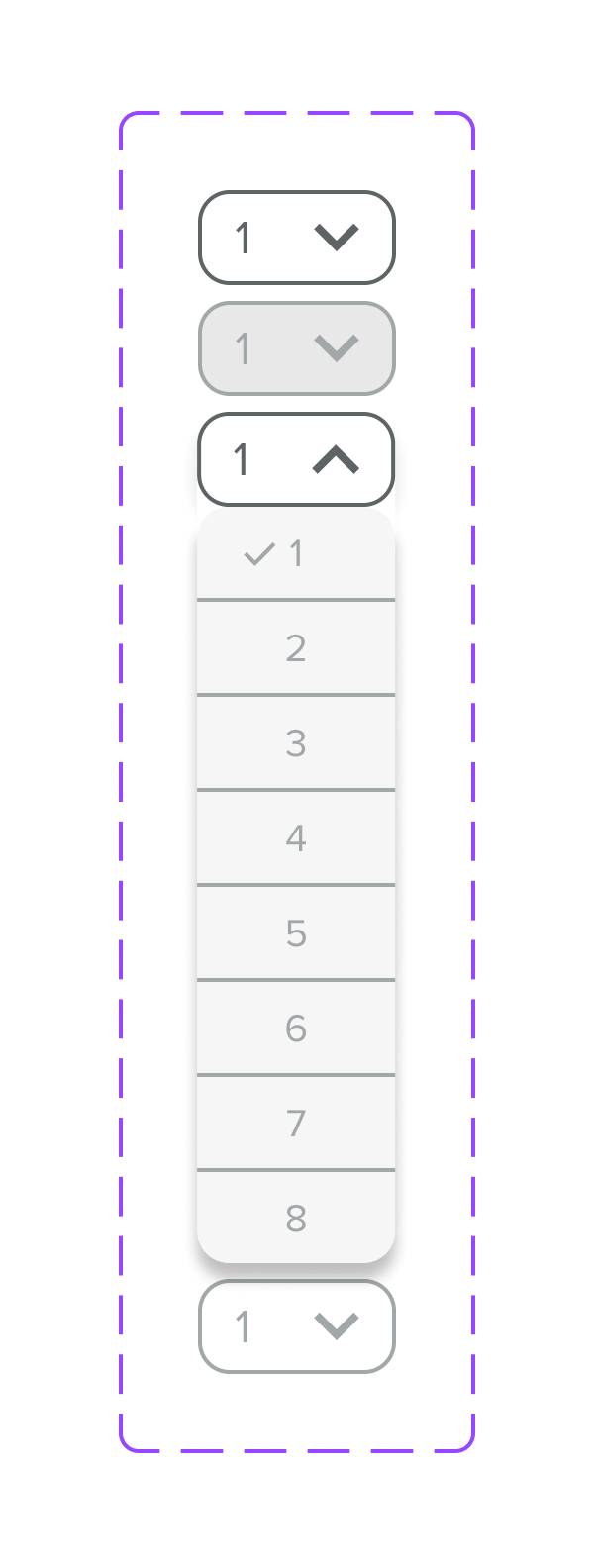
Navigation bars and search components were designed to support clear hierarchy, discoverability, and responsiveness across screen sizes. Variants accommodate different layouts and content densities, while tokenized spacing and typography allow the components to scale without manual overrides. Dropdown menus extend navigation functionality, offering structured access to deeper content while maintaining consistent behavior and visual alignment across contexts.
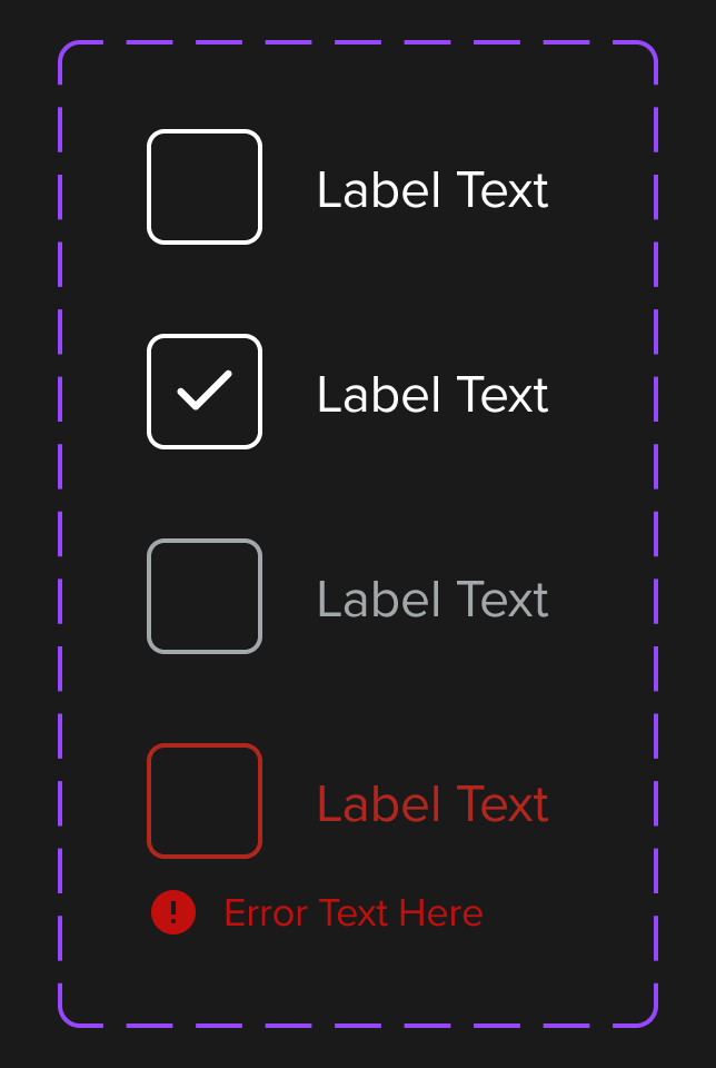
Form Controls & Interactive Elements
Interactive controls—including checkboxes, radio buttons, and toggles—were designed with clarity, accessibility, and feedback as core principles. States such as default, hover, active, selected, and disabled are defined system-wide to ensure consistency and reduce ambiguity for users. These controls rely on shared interaction logic and tokenized styling, enabling visual cohesion across forms while allowing flexibility in presentation.
Design Tokens & Variables
Enabling Speed, Consistency, and Brand Expression at Crocs
For the Crocs design challenge, design tokens and variables were used as the foundational layer to translate Crocs’ bold, playful brand into a scalable system that could be efficiently applied across web and mobile products. By centralizing core visual decisions—such as color, typography, spacing, and interaction values—into a token-driven framework, the system reduced repetitive work and enabled faster iteration for the UX team.
Instead of redefining styles at the component or screen level, designers could rely on a shared source of truth that ensured consistency while still allowing the brand’s expressive personality to come through in every interaction.
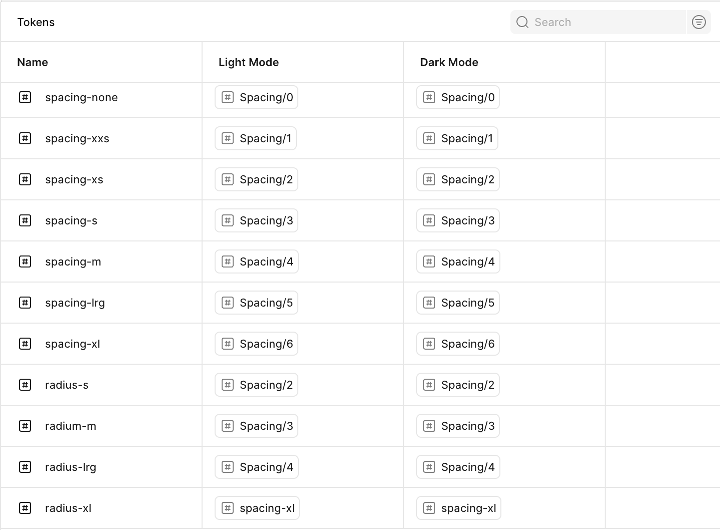
Token Structure Grounded in Product Needs
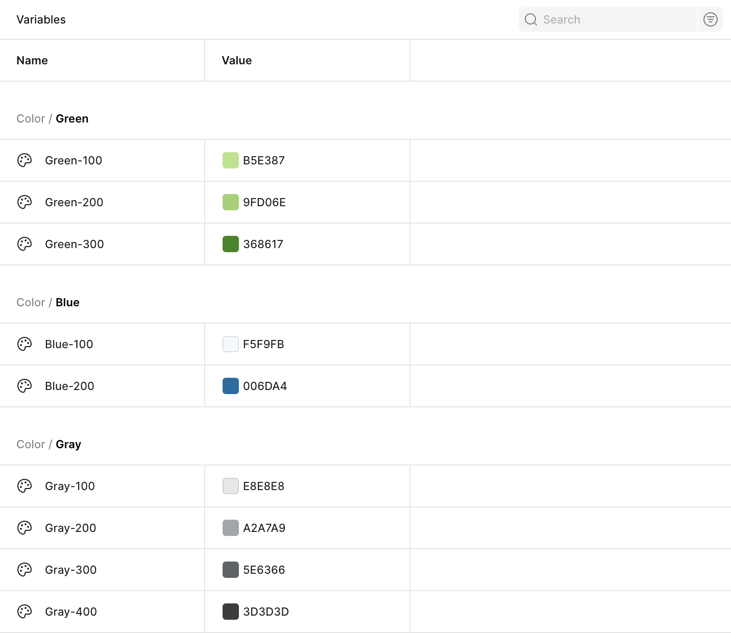
Tokens were structured to reflect how Crocs products are designed and built. Foundational tokens define raw values like brand colors, type scales, and spacing units, while semantic tokens map those values to functional roles within the interface—such as primary actions, emphasis states, and surface treatments.
This structure allowed the UX team to make updates with confidence, knowing changes would cascade predictably across components and layouts. It also supported accessibility considerations, such as maintaining contrast and readability across diverse use cases and platforms.
Variables for Cross-Platform Application
Figma Variables were used to connect tokens directly to components, making it easy to apply consistent styling across both desktop and mobile experiences. Components reference variables rather than fixed values, enabling rapid adjustments to accommodate different screen sizes, layouts, and interaction patterns without redesigning components from scratch.
This approach supports scalability across Crocs’ broader ecosystem, allowing the same system logic to be reused across product pages, navigation flows, and form-heavy experiences on both web and mobile. As new components or features are introduced, they inherit established token values automatically, accelerating production and reducing design debt.
Impact on the UX Team Workflow
By adopting a token-and-variable-based approach, the system helped streamline the UX team’s workflow by minimizing manual updates, reducing inconsistencies, and speeding up design iteration. Visual changes—such as refining brand color usage or adjusting spacing density—could be made centrally and applied system-wide, saving time and allowing designers to focus on higher-value problem solving.
This foundation demonstrates how a well-structured token strategy can support Crocs’ growing digital product ecosystem, enabling faster delivery, consistent brand expression, and a more sustainable design system across platforms.